McDonald’s current website offers limited functionality, primarily serving as an informational platform with no direct ordering capabilities. In today’s fast-paced world, where users expect convenience at their fingertips, this gap created friction—especially for time-sensitive customers like working professionals.
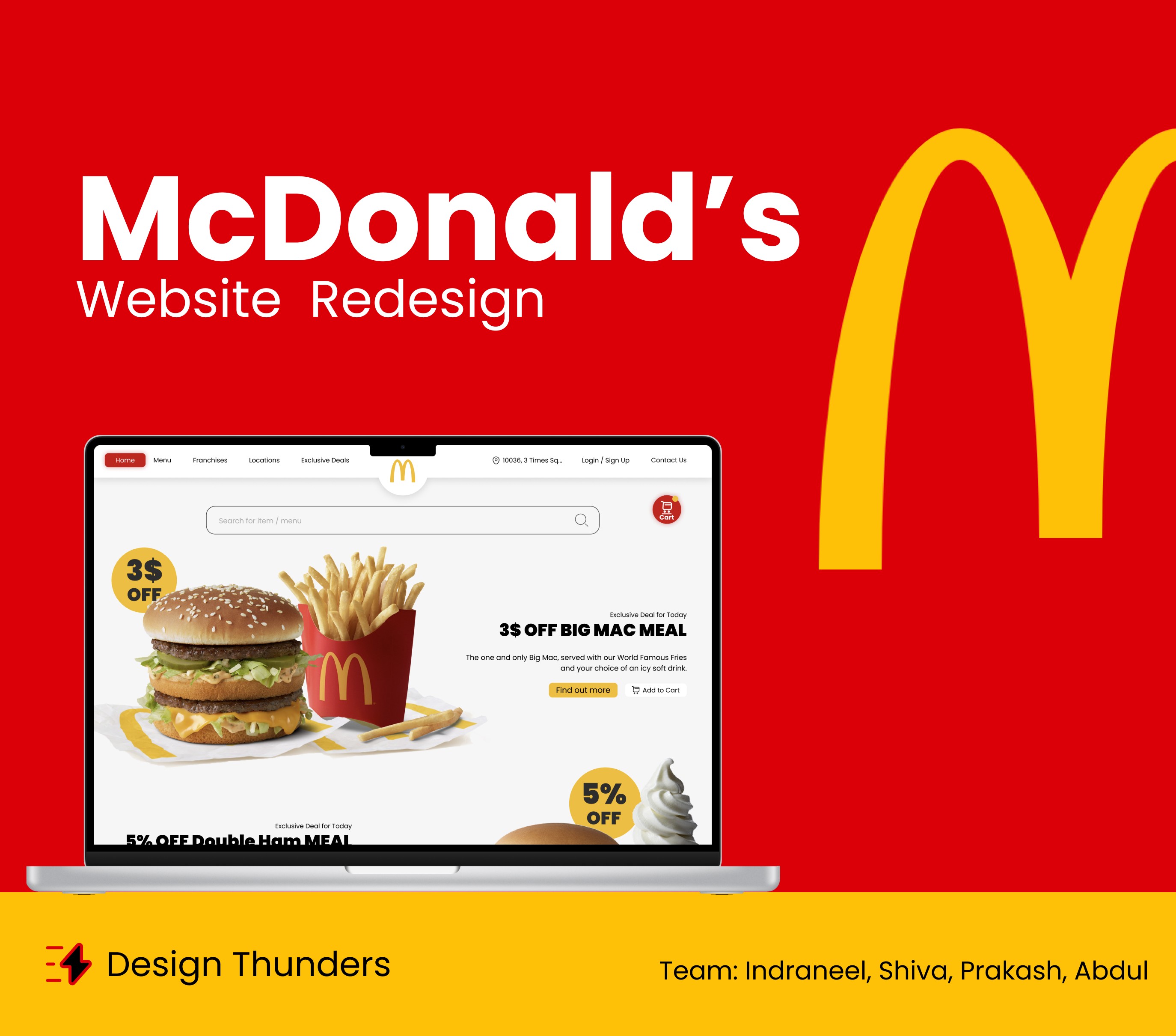
As a team project, our objective was to transform McDonald’s website into a full-fledged digital ordering experience—eliminating the need for an external app, and aligning the web platform with modern UX standards. The redesign focused on creating an intuitive, visually appealing interface that not only enabled online ordering and checkout but also encouraged customer retention through gamification and referral rewards.
This project was research-driven and concept-based, created as part of a school assignment to demonstrate our ability to identify usability gaps, ideate creative solutions, and execute a high-fidelity prototype grounded in real-world needs.
Client
School Group Assignment
Type
AX Design
Year
2024
Process
We followed a structured UX methodology throughout the project:
Heuristic Evaluation:
We began by evaluating the existing McDonald’s website using Jakob Nielsen’s 10 usability heuristics. This helped us pinpoint key usability issues such as lack of system feedback, excessive empty space, repetitive navigation links, and absence of user control.
HMW (How Might We) Ideation:
Using HMW statements, we reframed problems into opportunities—such as “How might we create a complete ordering and checkout option?” and “How might we apply gamification to encourage return users?”
Customer Journey Mapping:
We built a scenario-based journey around a persona (Lily), a busy professional needing quick breakfast delivery. The journey helped us empathize with user pain points like order delays, app redirection, and lack of real-time status updates.
Design & Prototyping:
Low-Fidelity Wireframes: Sketched the basic layout and page structure.
Mid-Fidelity Prototypes: Defined navigation, content flow, and user interaction.
High-Fidelity UI: Created polished, branded screens using Figma, enhanced with graphics from Illustrator and Photoshop.
Presentation & Testing:
Presented the final prototype to our peers and mentors.
Received feedback emphasizing clarity, logical flow, and visual appeal.
Mentors encouraged us to consider pitching the concept to McDonald’s or submitting it to a design competition.


Outcome
Enhanced User Experience
We designed a seamless, intuitive ordering flow that enables users to place orders directly from the McDonald’s website—removing the dependency on a separate mobile app and aligning the experience with modern UX standards.
Gamification Implementation
Inspired by concepts from Actionable Gamification, we introduced features such as reward points for every order, referral-based discounts, and redeemable offers. These elements were added to boost user engagement and retention.
Functional Prototypes Built
We created low-, mid-, and high-fidelity prototypes that captured the full user journey—from the landing page through to the order confirmation and delivery tracking screens. Each design iteration improved based on feedback and usability principles.
Positive Feedback
Our mentors and peers responded positively to both the strategy and visual direction. The concept was seen as not just a solid redesign, but a scalable idea worth pitching to real-world stakeholders like McDonald’s.
Takeaway
This project strengthened our ability to combine user research, problem-solving, and visual storytelling into a complete product experience. It also deepened our understanding of how thoughtful UX can directly influence business outcomes.

